WCAG Color Contrast
Web Content Accessibility Guidelines (WCAG) help to ensure that web content is accessible to users with various disabilities.
Color contrast is especially important to visually impaired users. The submission portal automatically ensures compliance with font size and screen reader support. However, the choices that you make when configuring secondary and text colors can impact accessibility.
To maximize accessibility for visually impaired users, you can use a contrast checking tool, such as the Image-Color.com Color Contrast Checker.
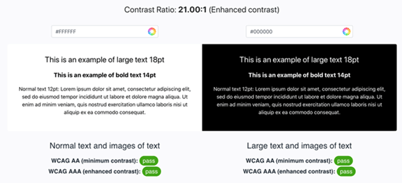
To check contrast, enter the HEX color code of the secondary color in the left-hand text box, and the HEX color code of the text color in the right-hand text box. The examples on the left and right will reflect your color selections. The pass/ fail indicators at the bottom will indicate if the colors have sufficient contrast to support visually impaired users.
